Website design can make or break the customer experience.
38% of people would stop using a website if it’s layout or design is unattractive. And over 48% of people reported website design as the most important factor in determining the credibility of a business.
Since design is one of the core ingredients for making your eCommerce website a success, we gathered some of the best practices to follow.
As Alina Wheeler, a top design and branding expert, said “Design is intelligence made visible.” So let’s help you do just that!
Why Do You Need to Follow These Best Practices?
Here’s why implementing these practices is important for your eCommerce website:
- To provide the best customer experience possible: A great customer experience is about making it really simple for customers to buy products from your website, while also making it a great pleasure for them. These practices will help you create a website experience your customers will love.
- To boost sales through conversion rate optimisation: Great design will help you convert more website visitors into paying customers, boosting your sales and enhancing business performance. Incorporating best practices in website design development is crucial for creating a successful e-commerce platform that drives sales and conversions.
- To improve customer retention: You don’t want website visitors or existing customers to leave your website and buy the same product from someone else. A great design will help you grab the attention of your website visitors, and encourage your customers to be loyal towards your brand.
- To reinforce your brand: Great design will speak volumes about who you are, what your brand stands for, and help you be perceived appropriately. At the end of the day, design is about great communication!
- To build customer relationships: People tend to trust websites that are designed well, and therefore, will want to engage more with them. This helps with building great customer relationships with trust at its foundation.

Best Practices for eCommerce Website Design
#1: Responsive Design
According to Similar Web’s “The State Of Mobile Report”, more than 56% of consumer traffic to the leading US websites is from mobile devices.
This highlights just how important it is for your eCommerce website to be accessible not only on desktop computers, but also on mobile and tablet devices.
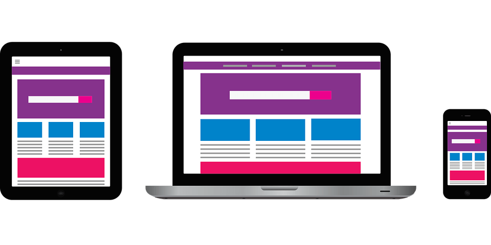
Responsive design enables your website to adjust itself to the device it’s being accessed from. All of the elements within the website, including images, video, or text, will align themselves in a way that won’t compromise the overall customer experience.
Responsive design is also important from an SEO perspective. Making sure your eCommerce website is responsive will help you provide an outstanding customer experience for everyone.
#2: Homepage Design
The homepage of your eCommerce website is basically your shop front. It’s what creates the first impression in your customer’s mind about who you are, what you do, and if they should transact with you.
Think about it the same way as you would with a physical store. If you saw a shop with an inviting, well designed front, you’d be more keen to walk in, and talk to the reps inside. On the other hand, if the shop front was messy, broken, or unclean, you’d stay away.
Great homepage design is about:
- An eye-catching first impression that holds the interest and attention of your audience. You can do this via a bold message, an amazing banner image, or background video, the choice is yours! The homepage has to hold your audience’s interest in less than a second, especially since consumer attention spans are becoming shorter.
- Building trust with your audience through excellent communication. Your homepage must instantly convey an image of credibility, authority in your domain, and should tell a story that resonates with your customers.
An excellent example of a well-designed homepage is the Dropbox Business website.
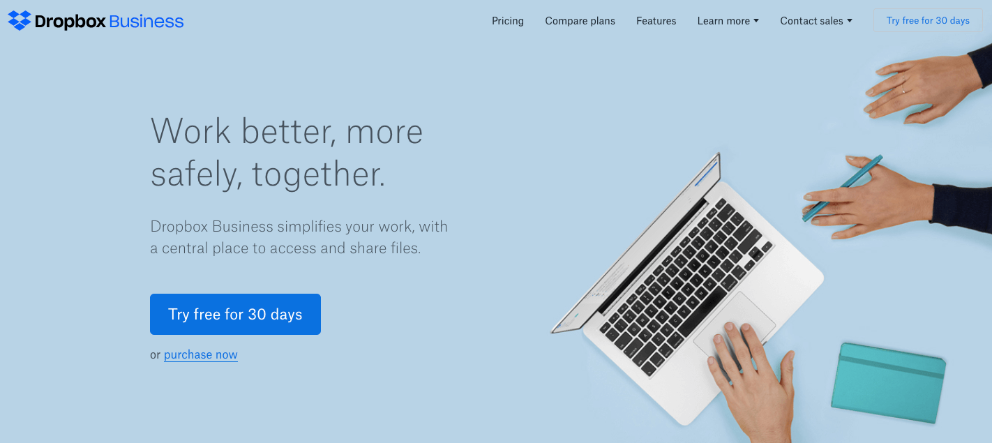
Notice how clearly the homepage communicates the main benefit of the product, right at the centre. It tells the customer what Dropbox can do for them, and gives them one simple choice to make: to try it for 30 days, or just buy it right away. This is perfectly in line with what a business customer expects, so they’re not wasting their time on the website and know upfront what they can expect.
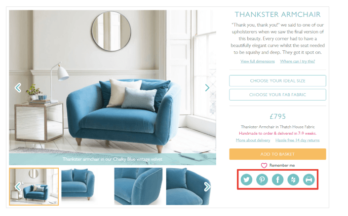
#3: Product Pages
The main goal of an eCommerce website is to sell products or services. Therefore, the pages on which products are displayed on the website, have a massive impact on whether the product ends up being purchased.
Designing high-quality product pages is an art, and must include the essential elements that make it wonderful. Some of these elements are:
- Product Images: To display a product well, you need to take great photos of it! Investing in professional product photography can help showcase your product in an impressive way.
Make sure you add the best product images to impress your website visitors. Some eCommerce websites use product videos too, which can make your product come alive. Choose images or videos depending on your budget.
- Product Description: Once you’ve got your visitors’ eyes gleaming after they see your product images, they will want to know more about it by reading the product description.
Ensure your product descriptions mention the benefits the product provides, and isn’t just a long list of features. Establish an emotional connection with your customers through the words in your product descriptions.
- Customer Reviews: No matter how great your product images and description are, customer reviews are the secret sauce that win your customers confidence to transact with you.
They provide your website visitors with the much needed assurance by sharing what other customers think about your product.
- Call to Action Buttons: Your call to action buttons should combine simple text with colours to encourage users to take the desired action.
Don’t make them ‘salesy’ or you might scare your customers away, but definitely make them action oriented and customer focused, so your customers feel like clicking on them.
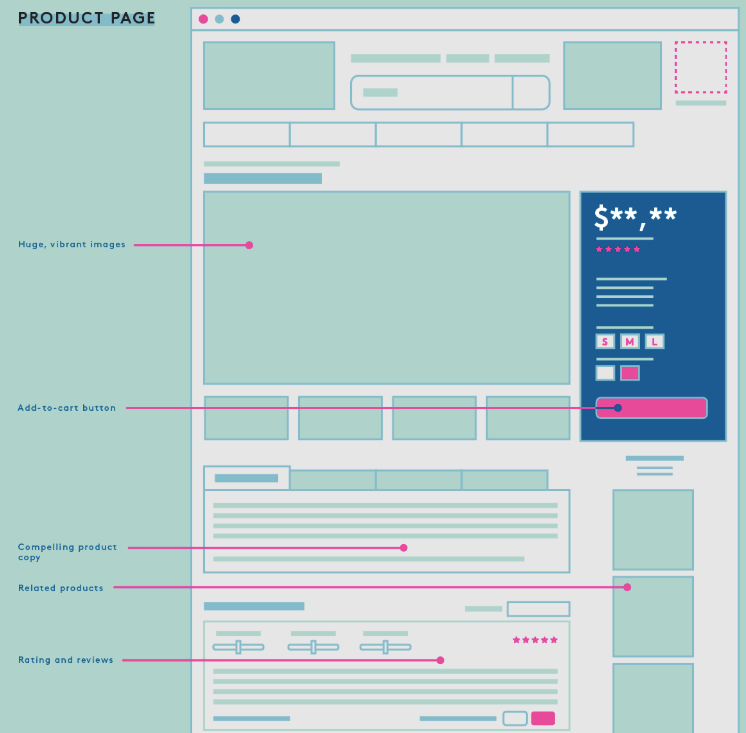
Have a look at what the ideal anatomy of a product page looks like below:
#4: Shopping Cart Page Design
A shopping cart page is a page that’s perpetually accessible throughout the eCommerce website experience. No matter what stage of the buying journey a website visitor is at, they should always be able to click on ‘View cart’ button on the website’s interface and see all of the products they’ve selected in a well organised manner.
The important thing to note here is that a shopping cart should allow website visitors to do exactly what an actual shopping cart would allow them to do! This includes being able to add or remove products, check prices, apply any discounts or promotional codes, and know when they would receive the products they’re ordering.
Customers that abandon the shopping cart page or exit the eCommerce website without making a purchase should be tracked. It’s important for you to follow up with them with an email or an ad and remind them about their unfinished purchase.
#5: Search Functionality
One of the main differences between shopping in a physical store and online is the search functionality. Offline shopping doesn’t always enable customers to find what they’re looking for in an instant. But in case of online shopping customers can simply look for the product via the search bar.
The search bar is like a ‘mini search’ engine within your eCommerce website, so making sure it’s well positioned and visible at all times is key.
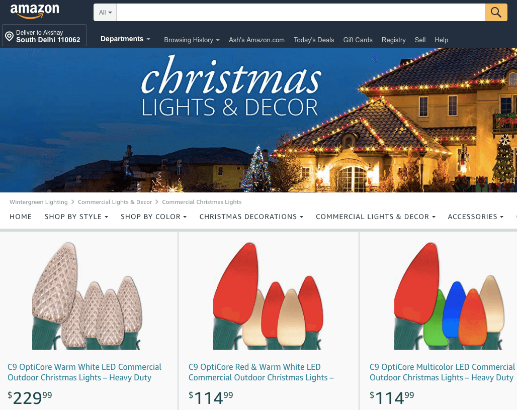
Amazon does a pretty good job with this. On searching for Christmas lights on their homepage, they display a range of available products, along with a Christmas theme banner image, with the search bar remaining visible, accessible, and ready to function.
Look how the search bar automatically populates suggested searches when you type the word ‘christmas’:
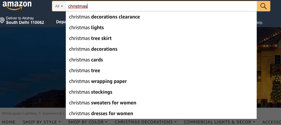
Amazon takes their customer experience very seriously, as the search bar is designed to help the customer find what they’re looking for with as little effort as possible.
#6: Checkout Page Design
The last page before a customer makes a purchase on an eCommerce website is the checkout page. This page can encourage them to finish the purchase or drive them away, so it’s extremely important.
The checkout page must provide the customer with payment options, and should not allow them to make the purchase without completing all necessary fields. This is to avoid the scenario where a customer makes a purchase and forgets to leave their address where the product should be delivered, or other cases that may contribute to a poor customer experience.
Another important thing to note here is that the page should prompt customers to complete all necessary information fields, but shouldn’t delete previously entered information as that may frustrate customers making them do more work than necessary to make a purchase.
All colours on this page should be geared towards helping the customer take the desired action and make a purchase as easily and effortlessly as possible.
#7: Out of Stock Items
It’s important that your eCommerce website actively tracks any items that are low on stock or about to go out of stock through by having it integrated with your inventory management system.
Any items that are about to go out of stock should be flagged on your product pages, so both customers and inventory specialists at your business are notified. For items that go out of stock due to excessive demand, you should mark them as ‘out of stock’ and, ideally, mention the date on which it’s likely to be back in stock or offer an option for the customer to leave their email address and get notified.
Remember that design is all about communication! So informing users whether your products are in stock or not is an integral part of this communication.
#8: Branding
Design is also about creating a visual appeal that represents your brand. The colours you use, the language you write, the images and videos you display, and navigation experience you provide – all do the ‘talking’ for your brand.
Ensuring there is consistency in your visual appeal across all marketing channels is key. For this reason, a lot of brands develop a colour palette or design palette specifically mentioning the colour codes and shades they use, so there’s no room for confusion when communicating with designers and web experts.
For instance, when you think Apple, you think of the white Apple logo against a black background, when you think McDonalds, you think of a yellow “M” against a red background, and so on. Your customers have these colour combinations stored in their minds, without them even knowing it. It’s like a subconscious branding related expectation, so make sure you meet it.
#9: Social Media
eCommerce website design and social media are closely interlinked. Just like offline shopping can become a pretty ‘social experience’ if your customers talk to their friends about it, the online experience can be quite social if your shoppers share it, talk about it, or show off their purchases.
That’s why including social share buttons on product and checkout pages, encouraging customers to share their shopping experience, gives them an option to connect with their friends.
Social engagement in the form of likes, comments, and shares enhances the eCommerce customer experience, and creates a certain ‘virality’ around a product that’s been bought.
The screenshot above illustrates a great placement of these social sharing buttons.
#10: Building Trust with Certifications
Another design element, which gives your eCommerce website more credibility and immediately creates trust with customers, is badges and certifications. Using known industry approved certifications and badges show your customers that you take your eCommerce business seriously, and have an interest in being a long term player.
An example of this is showing SSL certificates to demonstrate to customers that it’s safe to transact with you, and their payment information won’t be compromised. You can use badges and certifications to provide more assurance of your product quality too.
#11: Colours
Colours add soul to your design. It’s what gives life to your design layout and design elements. A small difference in the colours you use on your call to action buttons can either lead your prospect to making a purchase or not.
Dominant colours like red or black, for instance, can be a great choice for call to action buttons as they feel more energetic to consumers. Green is great for representing nature, health or anything organic, while blue is great for professionalism, trust, and authenticity.
Choose colours that represent your brand personality, create the right customer perception, and inspire action.
#12: Navigability
The best navigation design is one which doesn’t make customers think too much while navigating a website. Your website navigation should be intuitive, and feel natural to users.
Apple is the master of designing user experiences that are intuitive, as they believe in simplicity, such that even a 10 year old can guess where to click to get to their desired page. eCommerce user experience design is no different, and involves a high degree of empathy, combined with a deep understanding of your customers.
We’d recommend going through an exercise of doing customer personas, user research, and doing wireframes of your website, so you have a sense of how your website will flow, and feel like to your customers.

Wrapping It Up
The more you follow best practices in website design, the higher your chances of creating an amazing eCommerce customer experience.
A great way to test your website design endeavours is to use A/B testing. By designing two or more versions of the same website/webpage, you can test it with users to see which one drives better results. Heat maps are another tool which allow you to capture where customers spend the most time on your website, and which aspects of it they interact with, so you can double down on what’s working, and eliminate the rest.
Are you implementing any of these eCommerce web design best practices on your website?